Flogest: A Retro Display Typeface for Bold Digital Branding
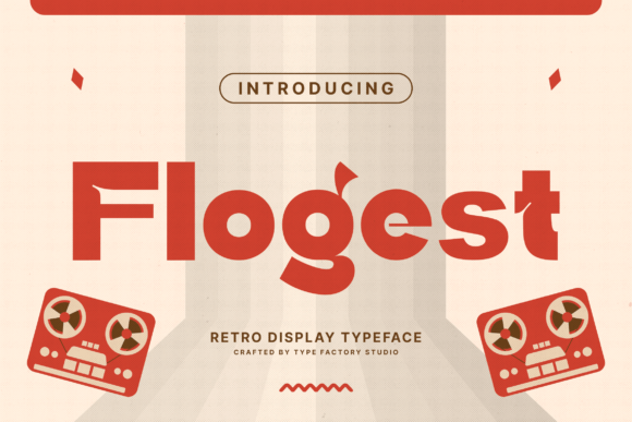
As a web designer who builds landing pages, SaaS dashboards, and boutique e-commerce experiences, I reach for display fonts not just for flair—but for function. Flogest stands out because it delivers unmistakable personality without sacrificing digital clarity. It’s a retro display typeface rooted in mid-century music posters, vinyl sleeves, and hand-painted storefront signs—yet built for today’s responsive layouts, high-DPI screens, and conversion-focused interfaces.
What makes Flogest work so well on screen? Its bold letterforms hold weight at large sizes without visual noise. The rounded curves soften sharpness just enough to feel approachable, while the subtle detailing—like tapered terminals and balanced counters—adds craft without clutter. Unlike many vintage-inspired fonts that lean too kitschy or overly distressed, Flogest strikes a clean, intentional balance. It reads as confident, warm, and human—not nostalgic for nostalgia’s sake.
Where Flogest Earns Its Place in Your Layout
Flogest isn’t meant for paragraphs or navigation menus. It shines where you need instant recognition and emotional resonance: hero section headlines, product name treatments, CTA buttons, course title cards, and brand logotypes. On a coaching website, pairing Flogest with a neutral sans serif like Inter or Manrope creates strong hierarchy—Flogest sets the tone; the body font delivers clarity.
In an online store for handmade ceramics or indie records, Flogest adds authenticity before the first word is read. Use it for category banners (“New Arrivals”), limited-edition labels, or featured collection headers. Its rhythm guides the eye naturally across grid-based layouts, especially when aligned left or centered over full-width imagery. On mobile, keep usage tight: hero titles at 48–64px (with line-height ~1.1), and never below 32px—even with generous tracking—since its rounded forms benefit from breathing room.
Readability & Responsiveness: Practical Notes
Flogest performs reliably across backgrounds. On light surfaces, it pops with crisp contrast. Over muted photography or soft gradients, it remains legible—especially when paired with subtle text shadows (1px black at 20% opacity) or light overlays. Avoid placing it directly over busy textures or low-contrast images without a background treatment.
For dark mode interfaces, test letter spacing carefully. At smaller sizes—like button labels or tab titles—Flogest can feel dense. Reserve it for larger-scale impact: headline variants, section dividers, or animated hover states (e.g., subtle scale-up on CTA buttons). It’s not ideal for micro-interactions or status badges, but perfect for “Launch Now” or “Join the Studio” moments that anchor user intent.
Smart Pairing for Digital Clarity
Flogest thrives alongside typefaces that prioritize function. For most web projects, pair it with a highly legible sans serif: Inter, Poppins, or even system fonts like -apple-system for speed and consistency. If your brand leans editorial—say, a design blog or creative newsletter—a restrained serif like Literata or Lora works beautifully for long-form content beneath Flogest headers.
Avoid pairing Flogest with other decorative fonts, script fonts, or condensed sans serifs. Its personality is strong enough to carry a layout alone. Let it lead, then step back. In CSS, define fallbacks thoughtfully: font-family: "Flogest", -apple-system, BlinkMacSystemFont, "Segoe UI", sans-serif; ensures graceful degradation if the webfont fails to load.
Licensing, Formats & Real-World Use
Flogest ships as a premium font with standard OpenType (.otf) and web-optimized WOFF2 files—ideal for self-hosted sites or platforms like Webflow and Shopify that support custom font uploads. It includes uppercase-only glyphs, basic punctuation, and multilingual Latin support (including accented characters used across Western European languages). No alternates or stylistic sets are included—keeping the family focused and predictable for branding.
Licensing matters: Flogest is a commercial font requiring a valid license for any public-facing use. That means covering it for client websites, SaaS dashboards, online stores, digital templates sold on marketplaces, and branded email campaigns. One license typically covers unlimited domains under a single business entity—but always verify scope with the foundry before deploying across white-labeled products or multi-client portfolios.
When to Reach for Flogest (and When Not To)
Reach for Flogest when you’re designing:
- A creative portfolio site where personality drives first impressions
- A boutique online store selling vintage goods, vinyl, or artisanal products
- A course sales page needing warmth and authority in equal measure
- A podcast or music brand looking to evoke analog authenticity digitally
- A brand kit component—logo lockups, social media banners, or email headers
Avoid Flogest for:
- Body copy, form labels, or interface microcopy
- Long navigation menus or footer links
- Small-screen notifications or toast messages
- Legal disclaimers or accessibility-critical text (it lacks extended language support or optical sizing variants)
Flogest doesn’t try to be everything. It’s a focused tool—one that helps designers communicate tone quickly, build visual rhythm intentionally, and reinforce brand identity consistently across digital touchpoints. Used with purpose, it becomes more than typography: it’s a quiet signal of care, craft, and confidence in how your audience experiences your work.