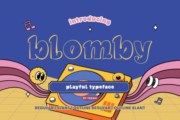
Blomby: A Display Font That Earns Its Space
First glance at Blomby? It doesn’t shout — it leans in. There’s a quiet confidence in its letterforms: generous x-height, subtle but intentional contrast, and a rhythm that feels both hand-tuned and digitally precise. This isn’t a display font built for chaos or novelty alone. It carries warmth without softness, structure without rigidity. The lowercase ‘a’ and ‘g’ have gentle, closed forms; the uppercase ‘S’ and ‘C’ curve with restrained elegance. It reads as modern typography, not trend-chasing — the kind of display font that supports voice rather than drowns it.
Where Blomby Actually Works — Not Just Looks Good
In logo design, Blomby shines when the brand values clarity with character — think boutique skincare lines, independent bookshops, ceramic studios, or mindful wellness platforms. Its balanced weight and clean terminals make it scale well from app icon to storefront signage. I’ve used it for a small-batch coffee roaster’s wordmark: legible at 16px on a mobile menu, commanding at 3.2rem across a matte-black bag. No distortion, no awkward tightening needed.
For packaging design and product labels, Blomby holds up under real constraints. On kraft paper with soy ink? Yes — its open counters and consistent stroke weight prevent filling-in. On glossy sticker stock? It gains presence without becoming aggressive. Unlike some creative font options that sacrifice function for flair, Blomby respects material limitations. That matters when you’re ordering 500 units and can’t afford a reprint because the ‘e’ vanished at 8pt.
In editorial design and blog graphics, Blomby excels as a headline anchor — especially for lifestyle, craft, or slow-living content. Paired with a warm, airy sans serif (like Poppins Light or Inter Regular), it creates hierarchy without tension. I used it for a quarterly print zine: section headers in Blomby Bold, body text in a classic serif. Readers told me the typography “felt intentional, not decorative.” That’s the goal.
Social media graphics benefit from Blomby’s visual weight and distinctiveness. On Instagram carousels or Pinterest pins, it grabs attention in under two seconds — but doesn’t trigger scroll-past fatigue. For digital ads, it performs best in short bursts: taglines, value props, or CTA overlays. Avoid stacking three lines of Blomby at equal weight — it loses breathing room. Instead, use Bold for the primary phrase, Medium for a supporting line, and let whitespace do the rest.
Where to Use Blomby With Intention — Not Assumption
Blomby is not a body text font. Never force it into paragraphs, captions, or navigation menus. Its personality is too strong, its spacing too generous. As a display font, it earns its place in large headlines, short phrases, brand marks, pull quotes, and decorative accents — not supporting text. I’ve seen designers misuse it in email footers or blog sidebars, and the result feels like wearing a tuxedo to a picnic: technically correct, contextually off.
Premium packaging? Yes — especially when paired with tactile finishes (embossing, foil stamping, letterpress). Blomby’s clean geometry translates beautifully to physical craft. Social posts? Ideal for quote cards, launch announcements, or limited-edition drops — but only when the message is tight and visual space is curated. Don’t drop it into Canva templates designed for generic sans serifs; adjust tracking manually. And skip Cricut projects requiring extreme thin cuts — its thinnest weight lacks the hairline precision needed for fine vinyl weeding.
What Blomby Does for Brand Perception — Beyond Aesthetics
Used well, Blomby reinforces trust through consistency. Its even color and predictable spacing signal professionalism — critical for small business owners building credibility without a big agency behind them. It avoids the “handwritten font” informality that can undercut authority, while sidestepping the cold neutrality of many sans serif fonts. The result? A brand identity that feels human-scaled, considered, and quietly confident.
Readability stays high in large sizes, but test it rigorously below 24px. At 18px on screen, Blomby Medium begins to soften — fine for hero banners, less so for secondary CTAs. Audience engagement lifts when Blomby anchors emotionally resonant messaging: “Hand-poured,” “Small-batch,” “Made here.” It doesn’t scream — it affirms. That alignment between tone and typeface builds recognition faster than any algorithm.
Designer Notes You’ll Actually Use
- Test Blomby in black and white first — color can mask spacing issues or uneven contrast.
- Check small-size readability on real mockups: phone screens, printed labels, fabric tags — not just desktop previews.
- Compare uppercase vs. lowercase usage. Uppercase Blomby has bold presence but loses some warmth; lowercase gives more approachability — choose deliberately.
- Review default spacing. Kerning pairs like “To”, “AV”, and “Wa” often need manual adjustment in logo design or tight headlines.
- Pair it thoughtfully: beside a sturdy serif (e.g., Merriweather) for contrast, a neutral sans serif (e.g., Lato) for balance, or a delicate script font for accent — never two display fonts competing for dominance.
- Confirm commercial licensing before using in client work, digital products, or printable design. Blomby is a commercial font, but licenses vary by vendor — some restrict web embedding or resale in templates.
Blomby isn’t a shortcut. It’s a tool that rewards thoughtful application. It won’t fix weak copy or unclear strategy — but in the hands of a designer who understands brand identity, packaging design, and web design constraints, it becomes a quiet differentiator. It works hardest where attention is scarce and intention matters most: on a shelf, in a feed, or at the top of a landing page. If your project needs a premium font that balances craft and clarity — not just charisma — Blomby earns its place. Just remember: respect its role, test it early, and let it breathe.